Pinterest has set the pace for how to present visual search results to those who are looking for pictures rather than words as answers. Now, Google has taken a cue from the startup in its own search product on desktop.
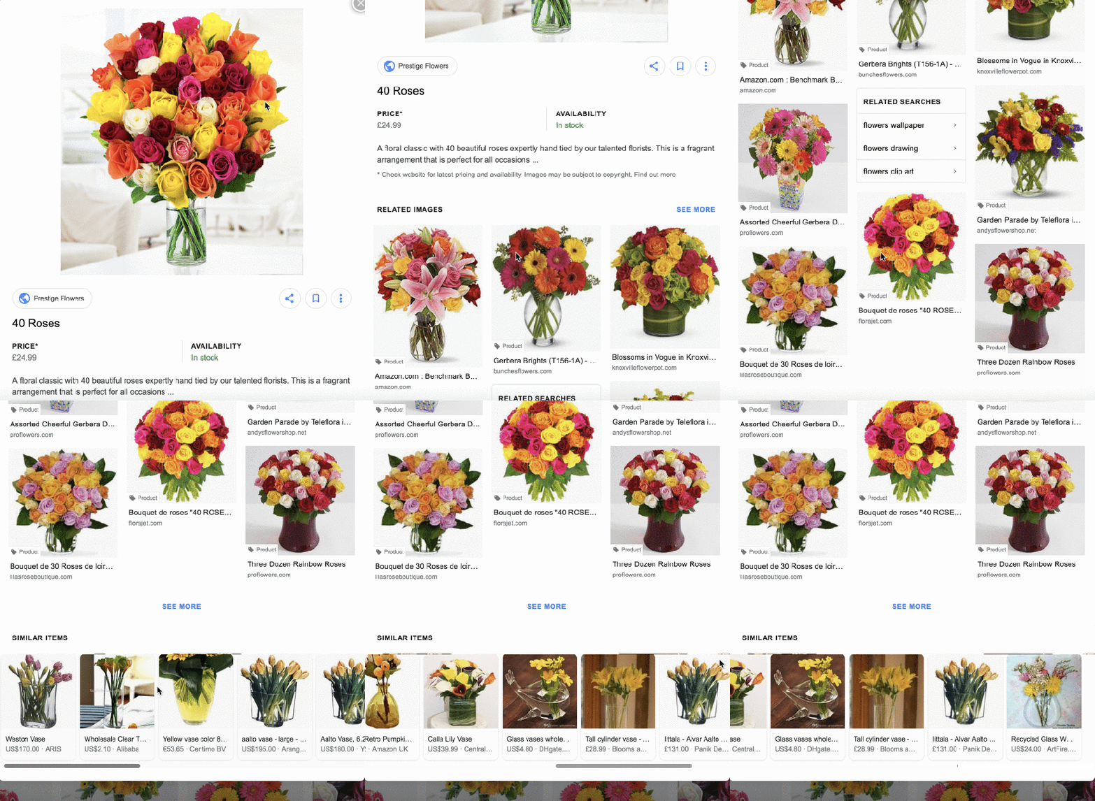
It’s testing a new look for its images search on desktop that is aligning pictures vertically rather than horizontally, making the results look more like Pinterest’s. The images now have short captions and sometimes small badges describing what it is (“product” or a video, for example).
And then, clicking on the images, you now get more dynamic information about what you are seeing. For example, if it’s a product, and the site selling it has worked with Google Shopping to upload results to Google, users can see information about whether a product is in stock and go directly to ordering it, along with not one but two lists of related images underneath.

Google confirmed the test but didn’t add more detail. “We’re constantly experimenting to improve our experience with Google Images and don’t have anything further to announce at this time,” a spokesperson said.
This is not Google’s first tip of the hat to Pinterest: the company actually added the dynamic information feature to its mobile app last year. Its Android search app also got upgraded with machine learning about a year ago to identify items in pictures and suggest related items.
In the new expanded feature item on desktop, users will now also see similar and related items, meaning some of that computer vision is also expanding to desktop.
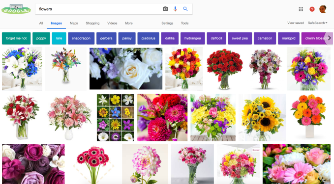
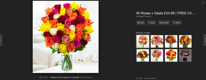
For some context, we’re also getting image search results that are still in Google’s standard horizontally-aligned grid. These results come with smaller images to fit more into each row, and when you click on them you get a larger image on a dark background, with the ability to click through to the site, or save or share the link (as you would with Pinterest) but no product details. This is what the old basic desktop image search and the “more information” box look like:


Google’s push to update the look its search for images is in line with how it’s gradually overhauling its whole search experience. The idea appears to be twofold: drive more engagement and clicks by making the results less static; and lead people to more conversions on purchases to help with Google’s commerce ambitions.
A visual search result with bigger pictures looks better, and those who are actually interested in buying something are more likely to use Google to do it if they are able to get more useful results from their searches. Linking up its image search with inventory and purchasing is one more step in Google controlling that experience and keeping users from simply jumping to Amazon or eBay after the search to look for and buy what they are seeking.
It’s also notable that Google has been leading on new user interfaces first on mobile before testing (and eventually rolling them out?) on desktop. When it comes to e-commerce, although mobile has made huge advances and has been seen to drive purchasing, desktop browing, with its bigger screen and presumably more sedentary experience continues to be a pull and still accounts for a significant proportion of purchases, especially in bigger-ticket items.
Earlier this year, Google launched an updated design for Google Images on mobile that includes captions on search results — which are also appearing in the test we’ve been seeing, but do not appear on current desktop search. This was on top of showing badges (like “recipe” or “product”) on visual results, which it also launched on mobile last year, and are also appearing in the test we have been seeing.
Others seem to be getting the same test, although response — on Twitter at least — has not been very positive.
Source: TechCrunch http://j.mp/2KcigX1
No comments:
Post a Comment