Shortly after announcing the Home Hub, a Google exec told me the timing was simply about “getting the product right.” Still, it’s curious launching your own entry in the space more than half a year after a trio of hardware partners debuted their own.
It’s easy enough to give the company the benefit of the doubt when you consider all of the variables in a nascent tech category that’s been around since, well, last summer. Amazon won the first to market prize with the Echo Show. It was a big, clunky thing, constructed from budget hardware — but it demonstrated the possibilities of adding a display to smart speaker.
The Echo Show 2 refined the concept, with a more thoughtful design and improved hardware, while a trio of devices from LG, JBL and Lenovo offered a glimpse at what Google Assistant could bring to the table. The Home Hub, announced a few weeks back (alongside a slew of hardware from the company), attempts to deliver that in the hardware sweet spot.
The smart screen sweet spot is, of course, a wholly subjective thing, depending on personal preferences and individual needs. It seems entirely plausible that next year will bring a Home Hub Max, but for now, Google’s settled on a seven-inch display. That puts the product in between the Echo Spot (2.5) and new Show (10-inch). But in spite of sporting the same screen size as the first-gen Show, Google’s managed to keep things compact.

I’ve seen the “ it’s just a tablet” criticism levied against the category by several angry/bored commenters. Google apparently said “screw it” and leaned in. The company insists that all of the tech was built from scratch here, but at first glance, it’s hard to shake the feeling that you’re looking at an OEM-ed Android tablet mounted on top of a speaker.
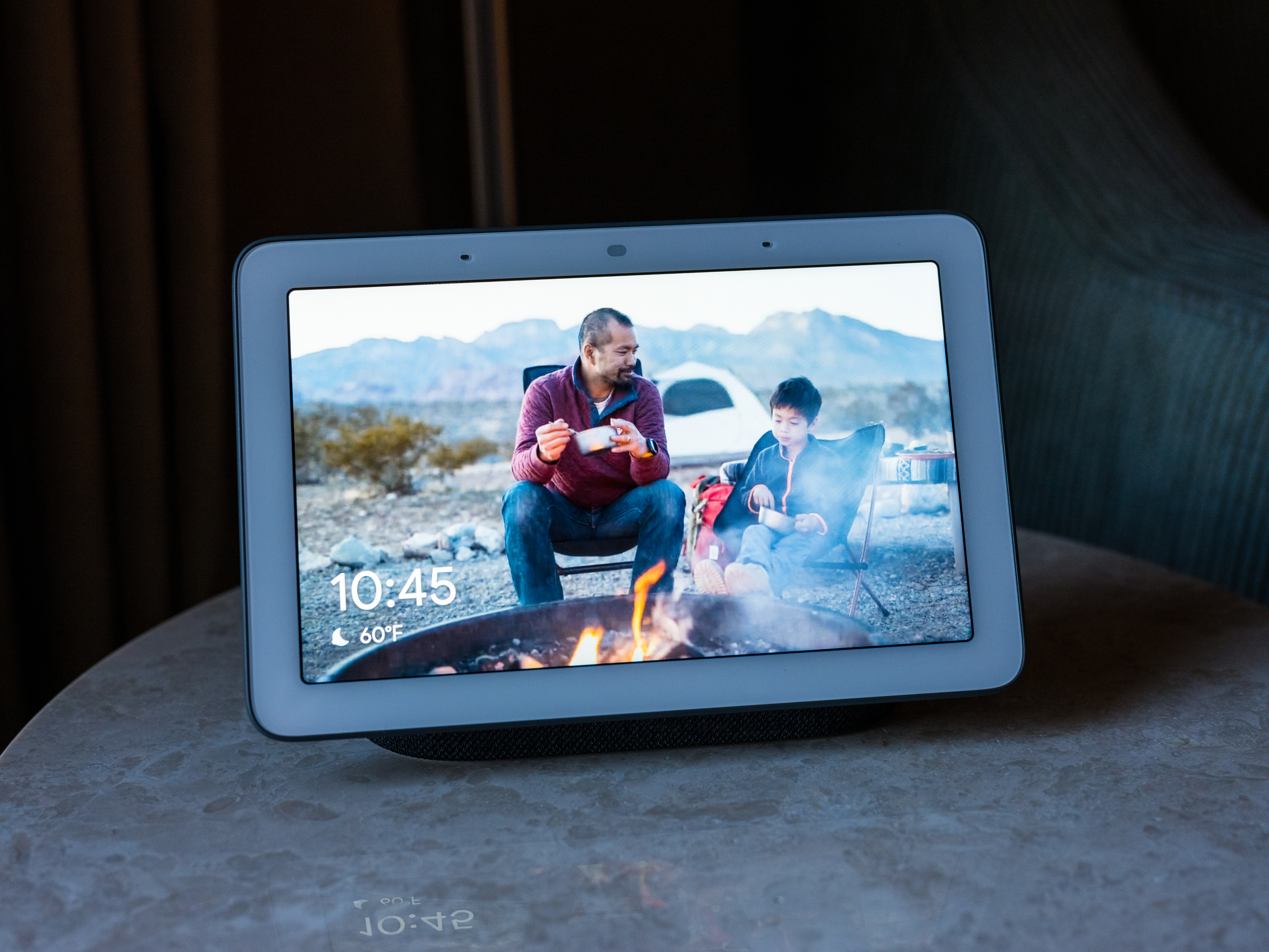
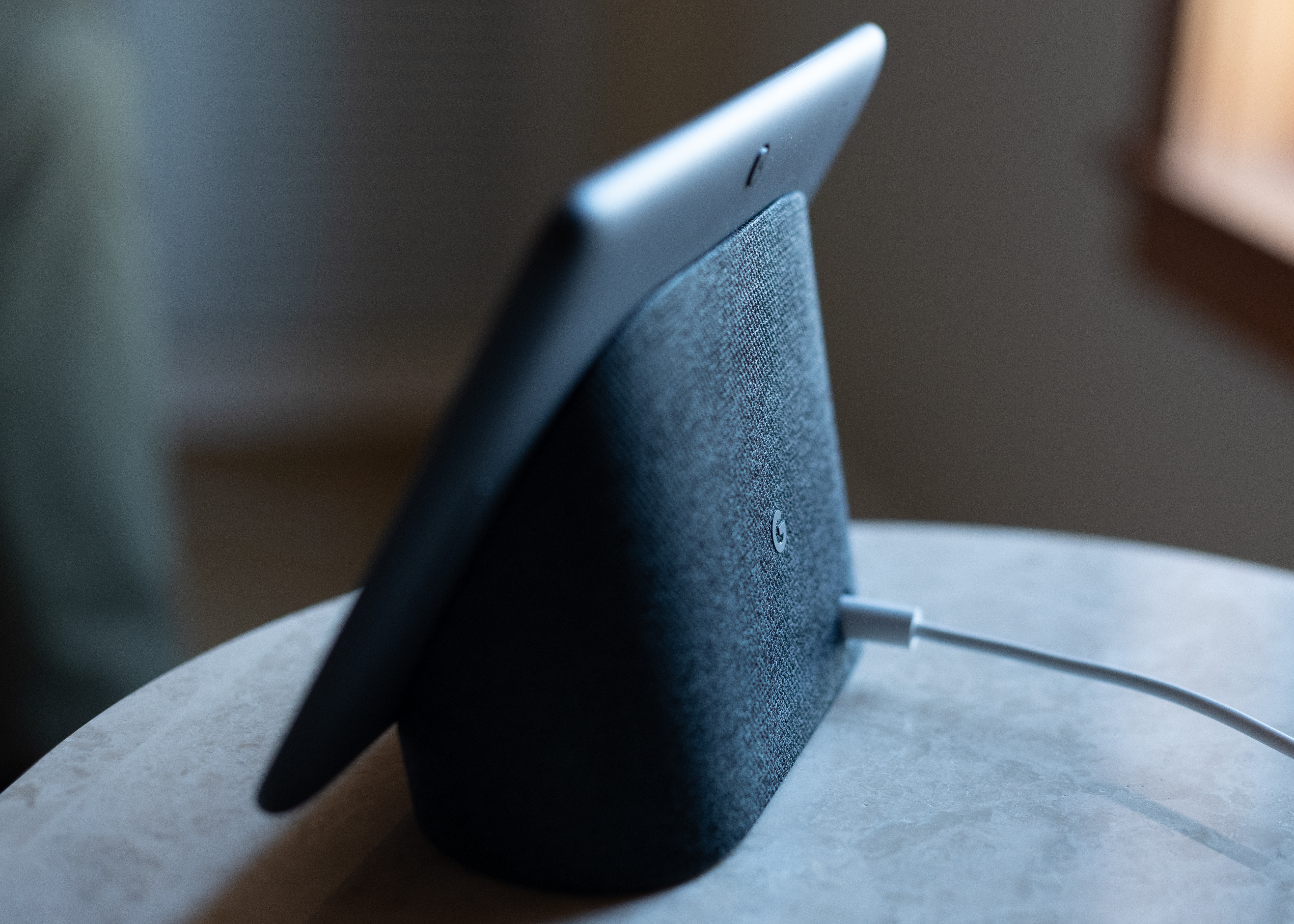
I wasn’t sure what to make of it, at first. It certainly wasn’t what I was expecting from the Home Hub. I’ve grown to like it, though. From the front, it looks a bit like a tablet floating an inch above the table, mounted at a ~ a 25 to 30 angle. The design implies a future upgrade sporting a swiveling screen with an adjustable viewing angle, but as it stands, It’s small but bright and easily spotted across the room.

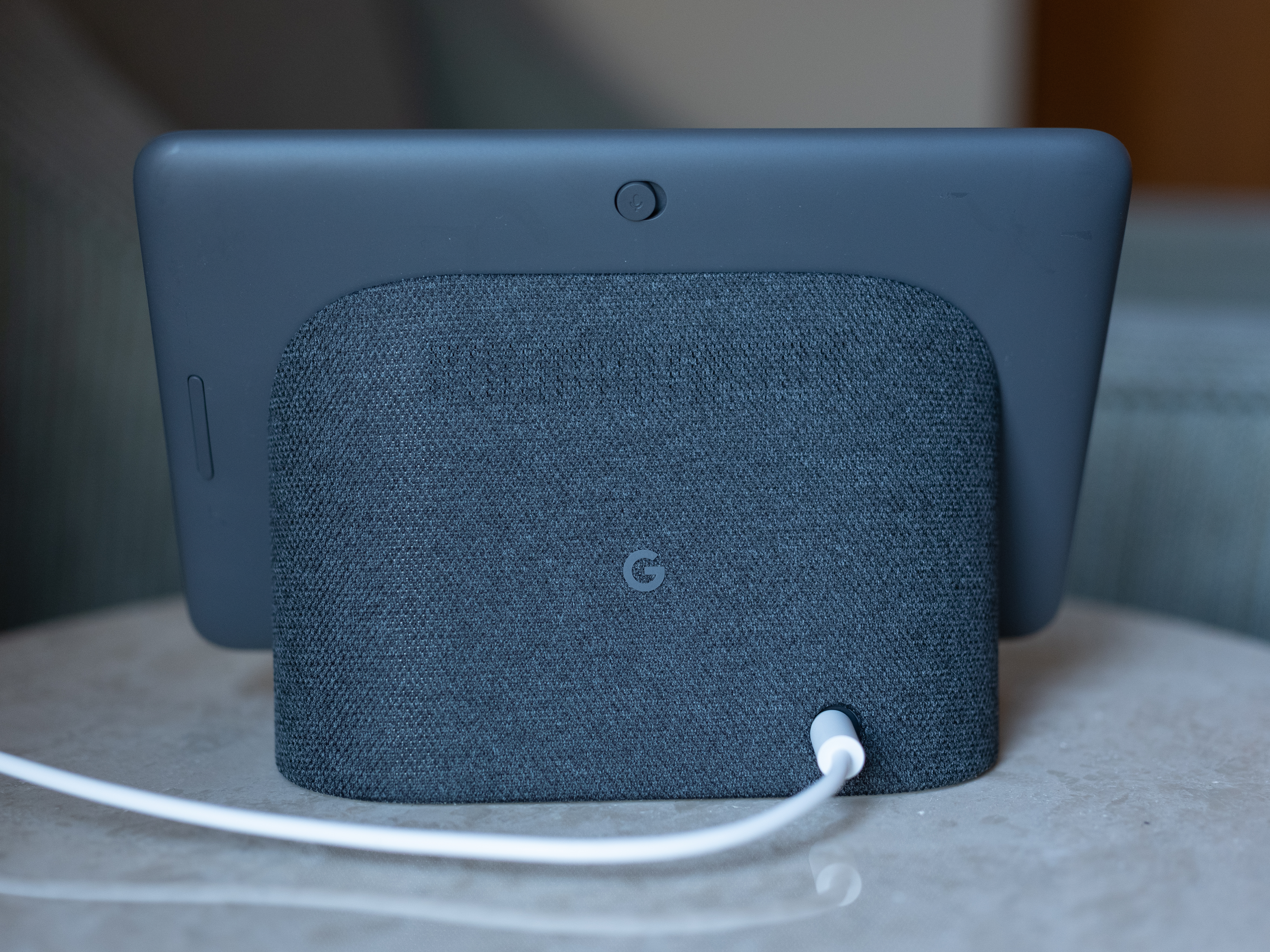
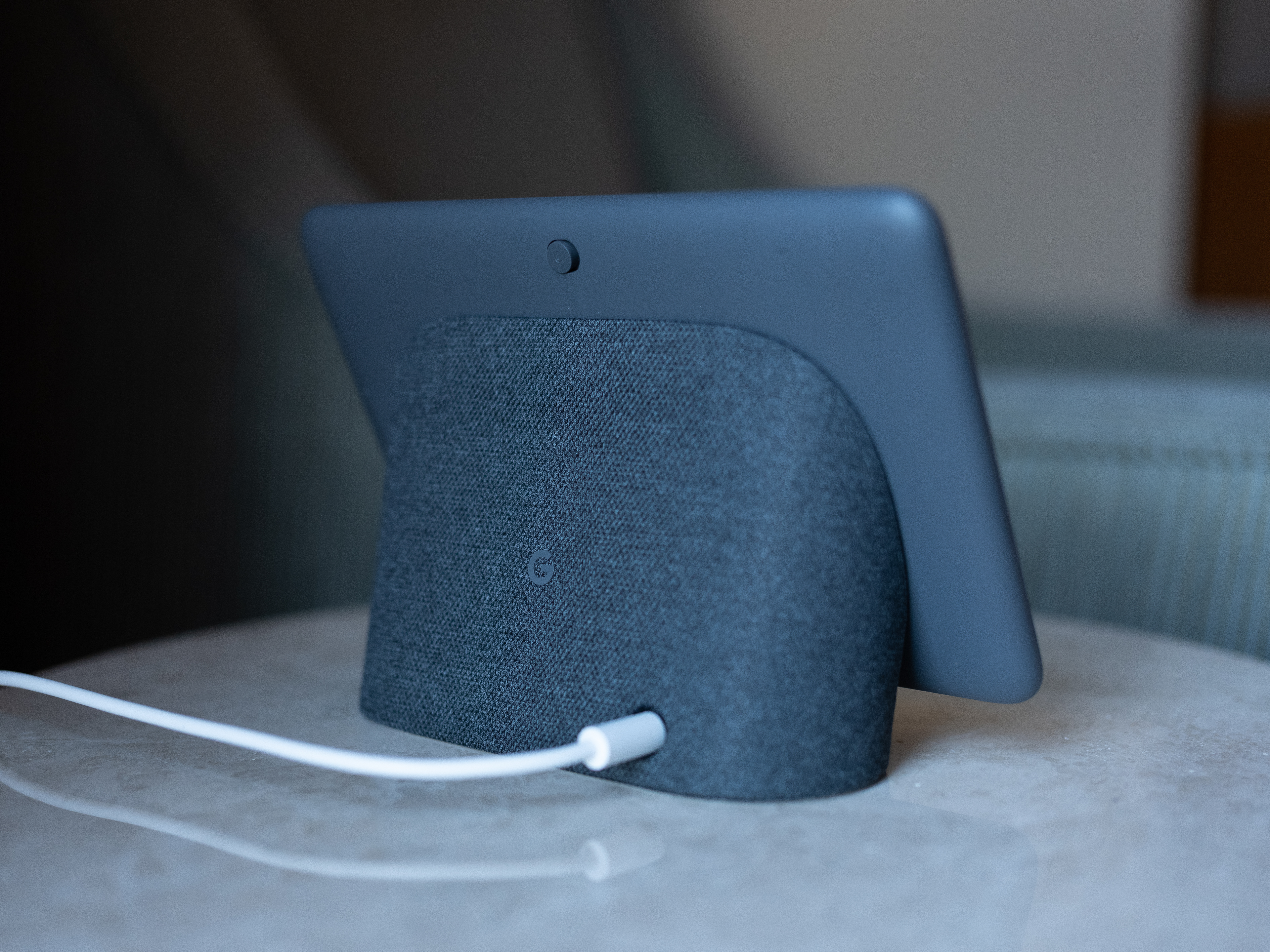
The speaker stand is fully covered in in fabric, in keeping with the longstanding aesthetic of the Home line, which has since found its way into the latest generation of Echo devices. Unlike other Home products, the device doesn’t exactly blend in with its surroundings any more than your tablet of smartphone. That said, the wide range of optional screen savers offers a generally more pleasant appearance when not in use, ranging from an AI-curated selection of your Google Photos to fine art to Earth and space shots from NASA. I’m partial to the Earth images myself.
The digital picture frame didn’t die, exactly. It simply disappeared for a bit, only to return as something far more useful.
The bezel is fairly sizable, owning, in part, to the light sensor and far field microphones up top. The display is 1024 x 600, as initially suspected — confirmed, oddly enough, by this tweet. We’re not talking top of the line hardware here, but it’s certainly up to serve as a playback portal for YouTube videos. And honestly, given the size, you’re probably not going to want to watch anything much longer than that.
The absence of a camera is a bit of a curiosity in the broader context of the smart screen category. That goes double after Facebook’s recent introduction of Portal, which basically exists for that reason alone. Here’s the Google’s official line on the decision, courtesy of a blog post from VP, Diya Jolly, “We consciously decided to not include a camera on Google Home Hub, so you feel comfortable placing it in the private spaces of your home, like the bedroom.”
It’s a good line, certainly. And given home many of these things are destined to end up bedside, as a sort of smart alarm clock, coupled with general concern over Google’s core business of collecting data, that will likely give potential buyers some peace of mind. Nipping those privacy concerns from the electric taping webcam contingent in the bud was likely a driver here. The lack of webcam also also no doubt helped keep the price down.
Either way, the inability to video chat may well be a dealbreaker for some, given what a core feature it is on Amazon and Facebook products. If there’s enough of a user outcry for the feature, however, I wouldn’t be surprised if the company ultimately reverses course. A camera and no camera SKU seems like a pretty solid way to please everyone.
That said, you can still use the built-in mics to call folks on your contact list or “Broadcast” messages to other Home devices on your network, as a kind of makeshift intercom system.
As for the microphone, there’s a physical switch on the rear of the device, which is easily accessed without having to turn the device around. When flipped, Assistant lets you know, “the mic’s off,” along with an icon that flashes on screen. A small red light also appears next to the light sensor up top. I’ve spoken to hardware designers who’ve debated the best way to acknowledge this, given the fact that, on many cameras, the red light signals recording. Practically all have landed in the same camp as Google here, however.

The other physical button is a volume rocker, located on the left rear of the device. You can also tell the Assistant to turn down the volume for you, but the inclusion of buttons is a nice touch for easy access when the display is nearby.
The speaker is actually the cleverest bit of Google’s design here. Compare it to the new Echo Show, whose speaker surface faces the wrong direction, requiring that the product be positioned around six inches from a wall, in order to get the best sound. Or there’s the Lenovo Smart Display, whose front-facing speaker significantly increases its surface area.
With the Home Hub, a majority of the speaker still faces back, but the raised display affords the ability to blast some of that sound forward. As for sound, it’s about what you’d expect on a product in this class. Like the screen itself, it’s perfectly fine for short videos or casual music listening. I wouldn’t, however, rely on it as my primary home speaker. The Home Max, among others, does a much better job.
There’s no auxiliary out port here, either, which is something I like to see on smaller speakers. That said, Google long ago built in the simple, “Hey Google, connect to bluetooth feature,” which searches for and connects to paired devices. It’s something I use regularly to connect my laptop to the Google Max — and a feature Amazon still hasn’t added at last check.
If you’ve got multiple Google speakers set up, the easiest way to switch between them without missing a beat is through the Home app. Otherwise things can get a bit confused. Pairing them into a single group (such as Living Room), meanwhile, will break the speakers up into stereo channels, offering a fuller version of the music, from either side of the room.

It’s a nice effect, especially when paired with the Hub’s display for a visual dimension. There are still some kinks to work out here, however. For example, when I said, “hey Google, volume down,” only one speaker responded. It would be great if the system assured both sides were operating at the same level.
The Home Hub is, of course, voice first. Given its size and shape, however, it ought come as little surprise that there’s plenty you can still accomplish via touch. At any point, for example, you can swipe up from the bottom of the screen to access brightness, volume and settings. Swipe down from the top and you get access to Broadcast and all of the home devices you’ve connected.
This control panel is one the Home Hub’s killer app. Broken down into different categories like lights and cameras (no action), the interface serves as a one stop shop for monitoring and controlling all manner of different settings on connected devices. Google’s embrace of touch controls are really what make this work, with the product serving as a kind of holy grail for home control, similar to what Apple’s been working on with its own Home app.
The device should connect quickly with all Made By or Works With Google devices. It’s a nice list, though the lack of an actual smart home hub is glaring — it’s right there in the name, in fact. The addition of Zigbee functionality was a pretty central upgrade in the last Echo Show. Google, on the other hand, is more focused on building its own ecosystem of products, as evidenced by the recent addition of GE smart bulbs that connect to Home devices via Bluetooth .
It will be a nice system when enough products have jumped on board. For now, however, the company has limited its device ecosystem a bit. That said, Google’s own device ecosystem is pretty robust at this point, between Nest devices and, of course, the Chromecast, which lets you stream video directly to the hub and control content from HBO NOW, CBS All Access, Starz and Viki via voice.
There are two more killer apps that require mention here. The first, YouTube, was already highlighted above. But Google owning the world’s largest video hosting service is pretty huge. There’s a reason it’s been the centerpiece of an on-going tug of war between Amazon and Google — not the mention the fact that Amazon’s reportedly been working on its response to the service.
The Echo’s browser-based workaround just isn’t the same. These things were built for YouTube.
The other is the depth of Assistant’s knowledge base. Google had a tremendous amount of search, context and machine learning here. And as a whole, its offering just feels smarter than Alexa. There are also nice little touches to to the interface that borrow design language from Gmail, Android and other Google properties. For example, when you open your calendar, you get a slew of dialogue boxes:
- Add an Event to My Calendar
- What’s My Next Meeting
- Show My Agenda for Tomorrow
- Set an Alarm
- Set a Reminder

Tap one, and you can add listings with your voice. It’s one of the best on-board examples of how the touch and voice functions work in tandem.
The Home Hub, like so many of Google’s hardware devices, is the culmination of years worth of software advantages. Here, they all come together in a nice, compact package, which, at $149 undercuts the competition pretty dramatically.
There are still a number of kinks to work out and some features the company ought to mull over for generation two. But on a whole, it’s a strong first entry for Google in the smart screen space, and one that’s mostly worth the wait.
Source: TechCrunch http://j.mp/2yWm4D0
No comments:
Post a Comment