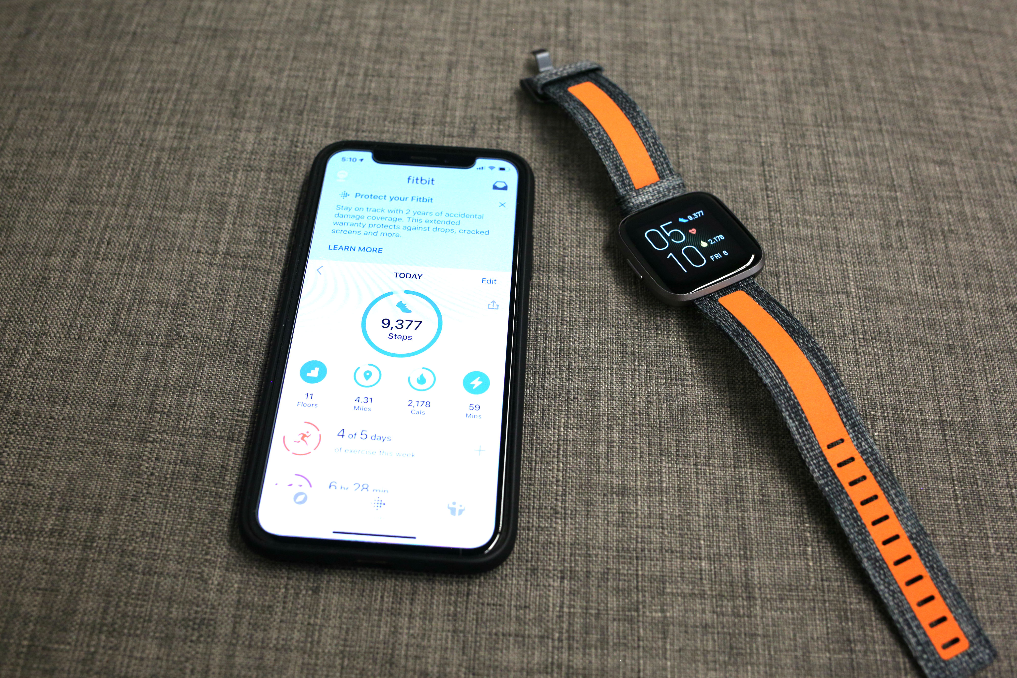
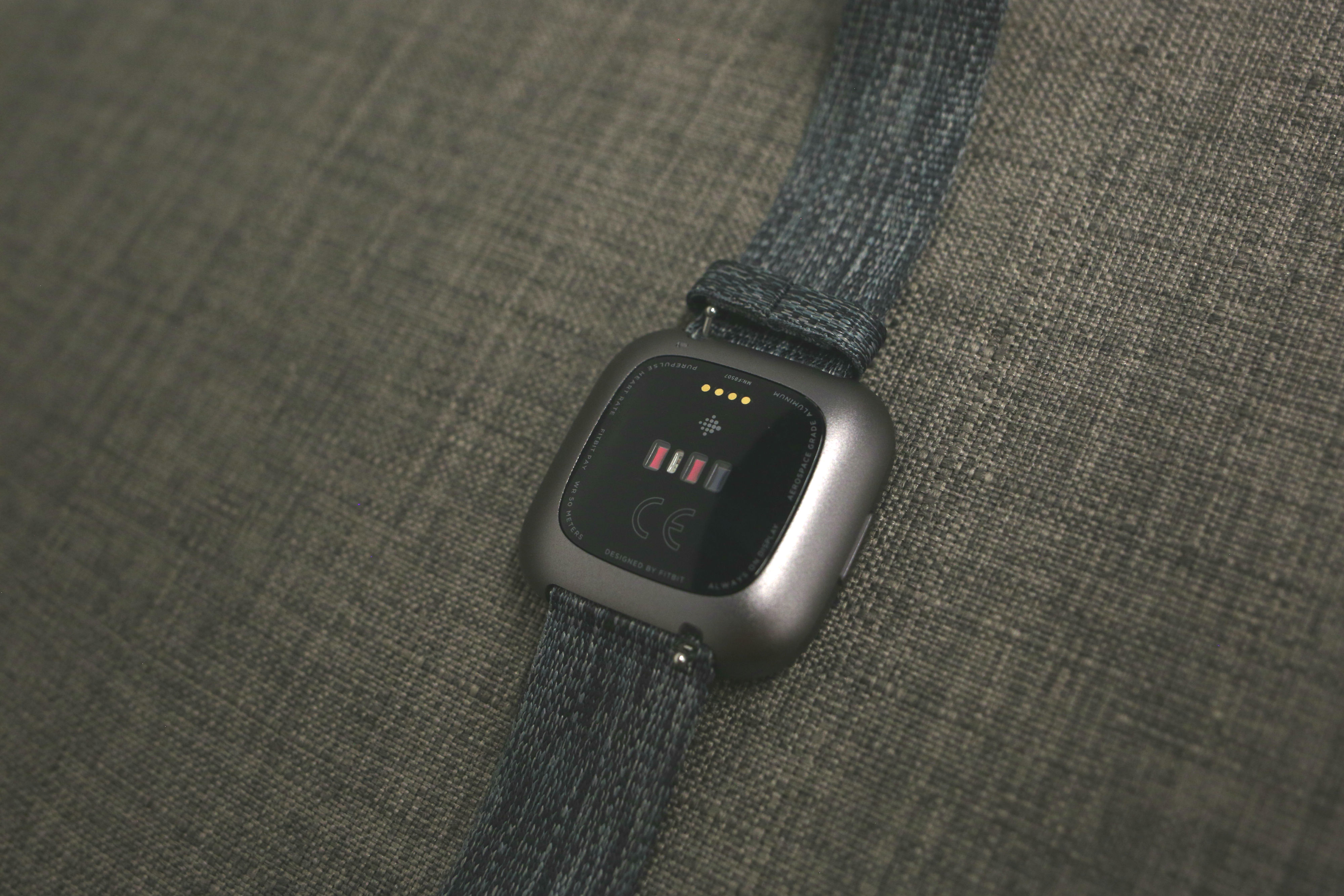
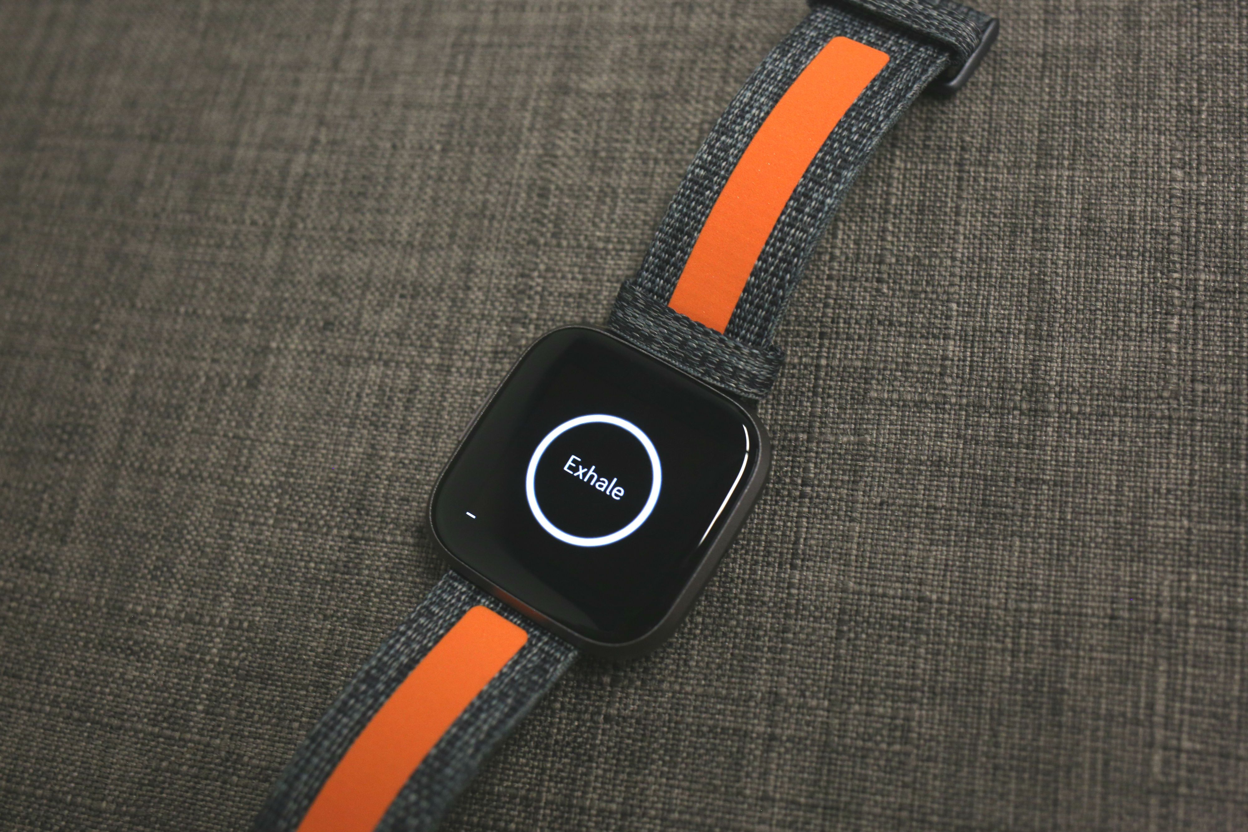
The Versa didn’t single-handedly save Fitbit, but it gave the struggling wearable company a way forward. The smartwatch demonstrated the potential for life beyond the fitness tracker. It also proved that Fitbit was finally ready to offer a product that could compete with the utterly dominant Apple Watch.
Last year’s Versa Lite was, by all accounts, a misstep. The device was an attempt to capitalize on one of the Versa’s strongest selling points: price. It was a miscalculation, however. The discount wasn’t enough to justify the missing features, and Fitbit’s financials took a hit as things finally appeared to be heading in the right direction.
By that account, the Versa 2 arrives just in time to help offset soft smartwatch sales numbers, a year and a half after the first device arrived. The new device doesn’t represent a radical departure from the first version. Nor should it. After the disappointing Ionic, Fitbit got things pretty right with the original Versa.
The smartwatch offered a solid, fitness-focused alternative to the Apple Watch for Android users and those looking for something cheaper than that $400 wearable. At $200, it’s priced the same as its predecessor. And that feels just about right, given the design and feature set.

Honestly, you can’t mention the design without invoking the Apple Watch. I’m sure Fitbit would rather have a conversation about the device that isn’t utterly dominated by Apple, but, well, the evolution of the Versa’s design is asking for it. Here’s what CEO James Park told me when the product launched:
“With phones, it’s like every phone starts to look the same. But for us, we try to blend a round design and the square design into what we call the squircle design that tries to capture both one that looks more like a traditional watch piece but still has a squareish form factor to display information. So we think we’ve struck the right balance. And I think whether it looks like an Apple Watch or not is kind of irrelevant. We’re trying to look at the customer experience and try to see what’s best for the user.”
There’s probably something to that, though to be fair, the default watch design is round, not square, and most non-Apple products have gone that route. That said, Fitbit did acquire the Pebble design team, and the argument can certainly be made that the new device shares some clear characteristics with the pioneering startup’s products.

Moving beyond those superficial interests, the hardware is quite nice, particularly given the $200 price point. The display has been upgraded from LCD to AMOLED, though it’s still surrounded by a pretty massive black bezel on all sides. The casing is a nice brushed metal — a dark gray in the case of the one I chose. I also opted for the 44mm version. It’s the larger of the two models, but it fits great — it was even reasonably comfortable to sleep in, which can’t be said for most smartwatches.
Good on Fitbit for making a 40mm version available, as well. This was a major oversight on past devices from a company with such a larger female user base.
There’s a single button on the device, which doubles as power and an Alexa trigger. That’s one of the bigger additions here. After spending millions on acquisitions to build its own OS and ecosystem, a smart assistant is probably a bridge too far at this point. A deal with Amazon, however, is mutually beneficial to both parties. Fitbit gets access to a leading smart assistant with little to no investment and Amazon gets a leg up on wearables.
Interestingly, there’s no speaker on the device. Alexa can hear you via the built-in mic, but it can’t respond accordingly. That means the answers are displayed visually instead. It’s a novel way to interact with Alexa and in most cases probably easier than holding your watch up to your ear. That said, Alexa was always irritatingly slow, first listening, then thinking, then returning the result. I’m not sure if that’s an easy software fix for Fitbit but it’s less than ideal.
The app selection has thankfully improved since last time as well. Fitbit’s still got a long ways to go to compete with Apple, but the addition of Spotify feels like a pretty big win for the company. It’s a big step up from the Deezer integration the Ionic launched with.
FitbitOS is fairly simple, but that’s fine. It works well with the small screen size. A decade of experience means Fitbit’s got a solid selection of health software features. It will be interesting to see what the company adds to the device with its $10 a month Fitbit Premium service. I’ve got some doubts on that one, but I’m willing to hold off judgement until I try it. Unlike Apple, Fitbit has offered sleep tracking for some time (expected to come to the Watch with tomorrow’s update). There’s a new Sleep Score feature, as well, which distills your patterns into something a bit more easily digestible.

The battery has been improved to five days, which was about right in my testing. That’s certainly a big plus over the Apple Watch, particularly for a device that’s meant to be worn regularly to bed. Obviously that number will fluctuate quite a bit depending on usage and whether you opt for the always-on display — another nice feature.
The Versa 2 is a nice update over the original. There’s not enough here to warrant an upgrade, but it should help maintain Fitbit’s spot as one of the few viable Apple Watch competitors. And that $200 price point certainly doesn’t hurt.
Source: TechCrunch http://j.mp/2N6QPPa
No comments:
Post a Comment