Google Maps is today introducing a series of new features to better inform travelers and commuters about how their trip may be impacted by COVID-19 — including travel restrictions, COVID-19 checkpoints, or even just the crowdedness of public transport. It’s also adding features that will help those traveling to COVID-19 testing centers better understand the eligibility and facility guidelines.
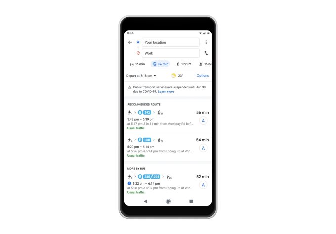
In several countries, Google says it will now display transit alerts from local agencies that will help users prepare for any government mandates that impact your ability to use public transit. For example, if services are closed or if you’re required to wear a mask, the alerts would include this information.
These are launching now in Argentina, Australia, Belgium, Brazil, Colombia, France, India, Mexico, Netherlands, Spain, Thailand, United Kingdom, and the U.S., where Google has information from local transit agencies available, with more countries coming soon.

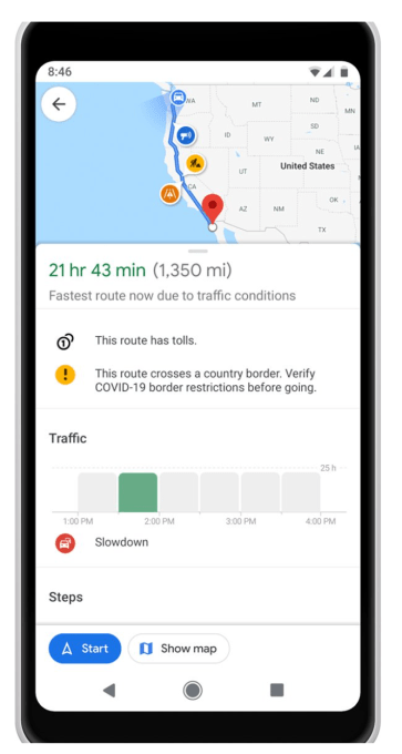
Google Maps will also now show if a trip’s navigation includes a COVID-19 checkpoint or restriction along your route, like when you’re crossing an international border. This is first launching with Canada, Mexico and the U.S., and will display an alert on the directions screen if your route is impacted. Google didn’t indicate any plans to expand this to more countries.

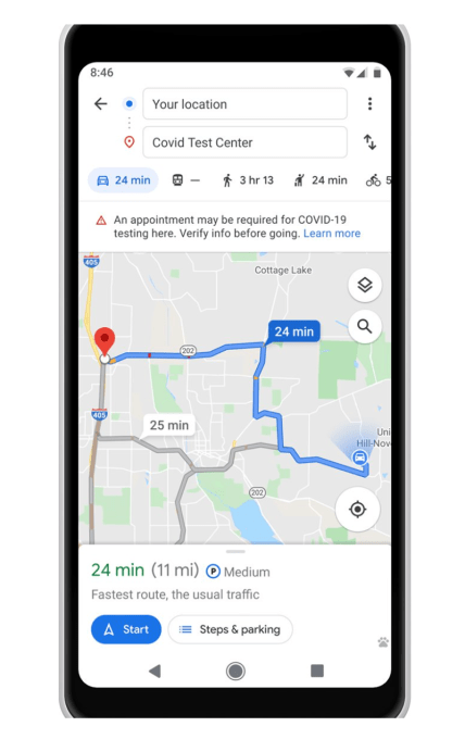
Similarly, alerts will appear when you plan a trip to a medical facility or COVID-19 testing center.
These alerts will be based on data Google receives from authoritative agencies, including local, state, and federal governments or from the center’s websites. Here, the idea is to make sure that people heading to a center are aware fo the guidelines so they’re not turned away upon arrival. For instance, if the center won’t see you without an appointment, that would be noted.

These alerts roll out first for medical facilities in Indonesia, Israel, the Philippines, South Korea, and the U.S., and testing center alerts will be available in the U.S. Google says it’s working to bring these to other markets and expand its work with agencies.
The updated Google Maps app will also expand access to the “crowdedness predictions” feature first introduced last year. This data is fueled by tens of millions of contributions from Google Maps users who ride public transit. Google crunched the numbers to make predictions about how crowded a particular bus or train line may be at a given time of day. It’s now making it easier for users to contribute their own observations.
In the updated app, when you tap through to see Transit directions when looking up a route, you can scroll down to see crowdedness predictions and add your own input, like “very crowded” or “not too crowded,” or other measures.

You’ll also now see the times when a transit station is historically more or less crowded or you can choose to look at live data by searching for a station in Google Maps or by tapping a station displayed on the map. This feature, which displays the departure board and busyness data, will roll out over the next few weeks.
This is powered by aggregated and anonymized data from users who have opted in to Google Location History. The company notes this setting is switched off by default and Google only displays the data when it has enough input to meet privacy thresholds.
Unrelated to COVID-19, Google Maps will also now roll out new transit insights like temperature, accessibility, and onboard security, as well as designated women’s sections in regions where available. These additions were first announced in February, but are now globally available. They also include more granular accessibility information for wheelchair users, like where there are wheelchair accessible doors, seating, stop buttons and more, Google says.
The expanded set of features will be live on both iOS and Android, in the markets where they’re available.
Source: TechCrunch https://ift.tt/2YbZgvL

No comments:
Post a Comment