The Versa helped Fitbit reverse its fortunes after a long, gradual slide. The company was slow to embrace the smartwatch, and stumbled somewhat out of the gate with the Ionic. But the Versa found a perfect sweet spot that build atop generations of wearable health knowhow, key acquisitions like Pebble and a pricing sweet spot at $200.
In fact, other big-name smartwatch makers like Apple and Samsung have since followed suit, offering up more budget-friendly approaches to the category. The moves came as Fitbit and a slew of Chinese device makers were nabbing market share through budget plays. But while the competition zigs, Fitbit zags, I suppose. That’s where the Sense comes in. It’s a return to the premium pricing the company put on hold when it let the Ionic fade away.
At $330, the Sense falls under the lower end of premium — at least compared to say, the Apple Watch Series 6 and Galaxy Watch 3, which both start at $399. The premium market isn’t the most logical play for a company that has been successful at a lower price point, but it’s perhaps understandable that the company is interested in expanding on its fortunes, legacy software and health metrics and finally, properly trying to beat Apple at its own game.

Image Credits: Brian Heater
While Fitbit has a bit of a history flooding the market with different devices, I do think the decision to introduce an entirely new product makes sense here. Really, the worst Fitbit could have done was add a bunch of features to the Versa and raise the price by $100, thus removing one of the product’s primary selling points in the process (though the Versa’s price has also increased to $220).
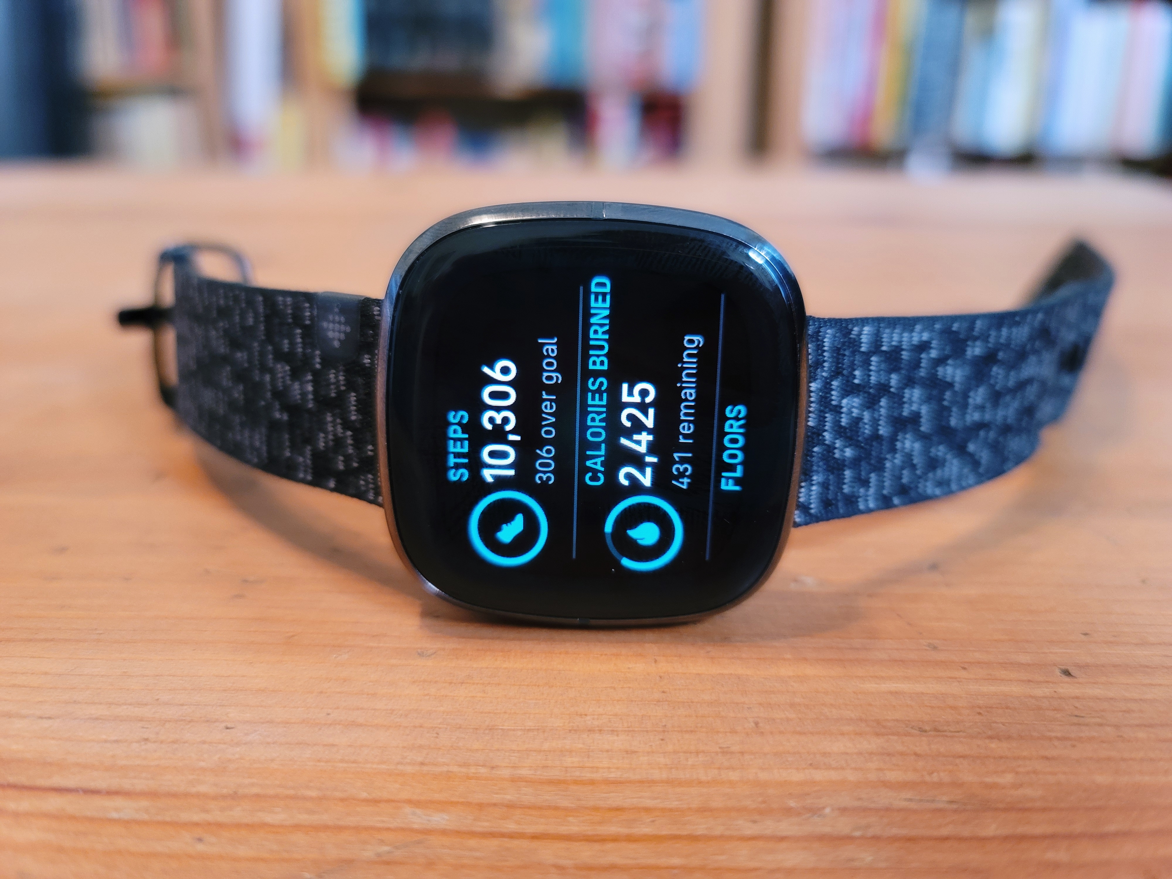
The truth is, the Sense and Versa 3 are actually more alike than they are different. The similarities start with the casing. The two products look virtually identical, aside from some different color options. The Sense comes in, arguably, classier colors with either gray or gold. The display is the company’s familiar squircle, which is only available in the one size.
I suspect Fitbit learned its lesson about unwieldy watch designs with the Ionic. The device sports a 1.58-inch display, which feels about right. And the square design makes it feel more compact than Apple’s comparably sized watch. That said, more watch sizes is always a good thing, particularly for a product like the Sense that’s attempting to appeal to a wide range of wearers.
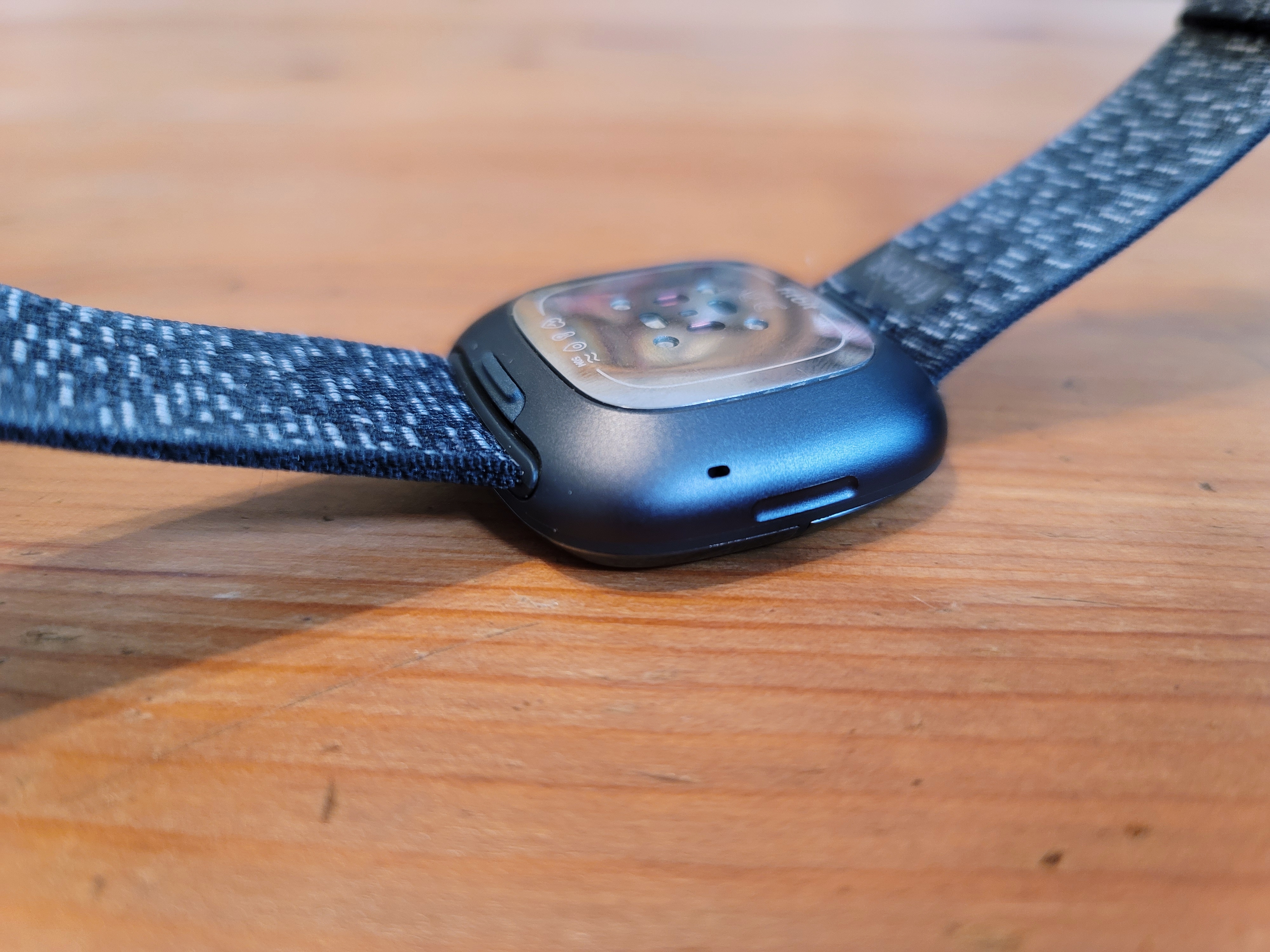
Unlike Samsung and Apple’s smartwatches, there’s no standalone dial-button for navigating through screens. There is a pressure-sensitive button on the side of the device, though that ultimately was a bit of a nuisance. I found myself repeatedly accidentally triggering it while moving my wrist. And honestly, for most actions, simply swiping across screens is perfectly fine.

Image Credits: Brian Heater
As the name implies, the biggest difference between Fitbit’s latest smartwatches comes down to sensors. The Sense has a lot packed in here. Both feature optical heart-rate monitoring, a temperature monitor and an SpO2 sensor — which was possibly the biggest upgrade announced for the Apple Watch Series 6. The Sense, however, is alone as the first Fitbit to adopt an ECG sensor, bringing it up to speed with the new Apple Watch on that front.
As is often the case with these sorts of sensors, I’m unable to really highlight it in the review. FDA clearance seems to be a bit more straightforward as the feature has become more and more common on consumer devices, but while Fitbit has cleared it, the functionality won’t be rolled out on the devices until next month. When it does arrive, you’ll get the kind of health readouts we’ve come to expect from these sensors, including heart rhythms and notifications for any usual activity.
Sleep tracking is one place Fitbit has had Apple beat for some time. The latter is attempting to change that with the latest version of watchOS, but still has a lot of work to do in order to catch up. The array of sensors go a long ways toward providing a more complete picture of your sleep over the course of the night. While Apple’s offering largely revolves around things like time in bed and time asleep, Fitbit provides a fuller picture, including, importantly, sleep quality, broken up by REM, light and deep sleep. SpO2 and heart rate are also factored into the picture. SpO2, in particular, will become an increasingly important factor in sleep going forward, as these devices look to track things like sleep apnea.
Another big piece of sleep is battery life. That’s something Fitbit’s been good at for a while. The Sense is rated at six days. Your mileage is going to vary considerably, however, depending on whether you opt for the always on display and other features. As it stands, I was able to get several days on a single charge with the feature switched off. Frankly, that’s a pretty big advantage over Apple’s stated 18 hours. Charging each night before bed or first time in the morning isn’t ideal.

Image Credits: Brian Heater
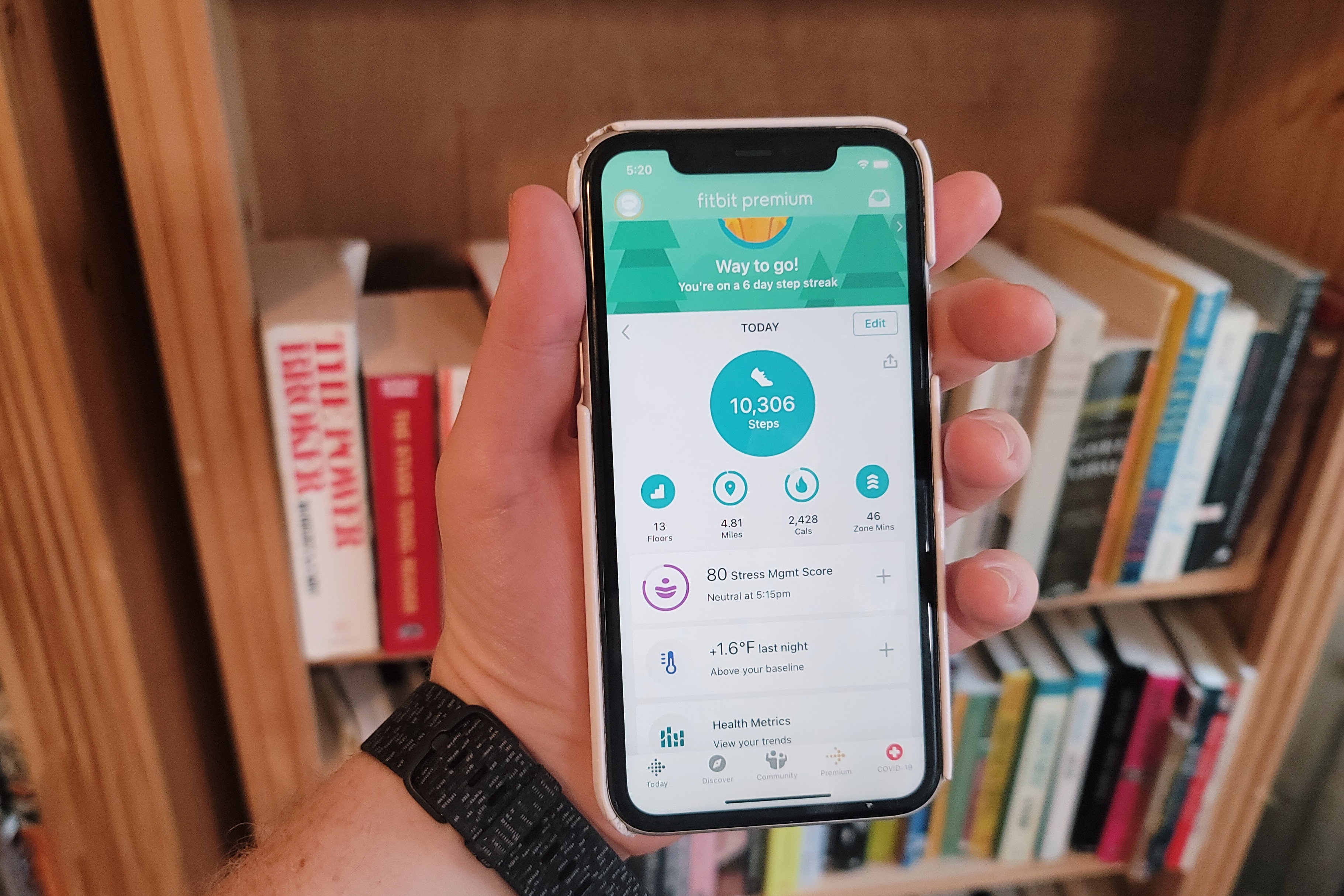
I appreciate Fitbit’s focus on mindfulness. I think it’s something we can all use a bit more of these days. I definitely include myself in that boat. Fitbit is one of a handful of smartwatch makers currently looking to push the concept beyond simple breathing exercises. That’s included in the Mindfulness tile. The company will quantify relaxation using the the on-board sensors. I honestly haven’t used it a ton, but anything that can help jumpstart a mindfulness practice is a net positive.
The Sense’s software continues to still be fairly basic. And while there are plenty of watch faces, the app selection lags behind some of the bigger names. It will be interesting to watch how Fitbit’s approach to software changes if/when the Google acquisition goes through. After all, wearOS has been around for a while and received plenty of updates, but still has its share of shortcomings.
The Sense’s strong suit is also Fitbit’s: a strong underpinning of health and fitness focus. The company certainly has a good, solid history of upgrades. But while it packs more sensors than the Versa 3, for many the difference will be relatively minor — and perhaps difficult to justify that $100 price gap. I’ve yet to spend a lot of time with the latest version of that device, but if past is any prologue, it’s a solid choice for those looking for an Android-compatible Apple alternative at a good price.
Source: TechCrunch https://ift.tt/3kJh6Qu
No comments:
Post a Comment